
Hi everyone! It feels like Spring here! A beautiful sunshiny day in Iowa!
My card today is using NEW dies from Memory Box and NEW Stencil set and die from poppystamps.
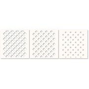
I started by inking the stencil set with three colors of Distress Oxide ink. Shabby Shutters for the largest square hole stencil, Peeled Paint for the next size and Forest Moss for the smallest. (it’s greener in real life)
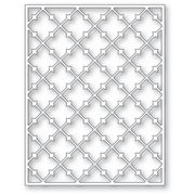
Then I die cut the NEW Pointy Lattice Plate from poppystamps in white cardstock to glue over the top of the stenciled panel.
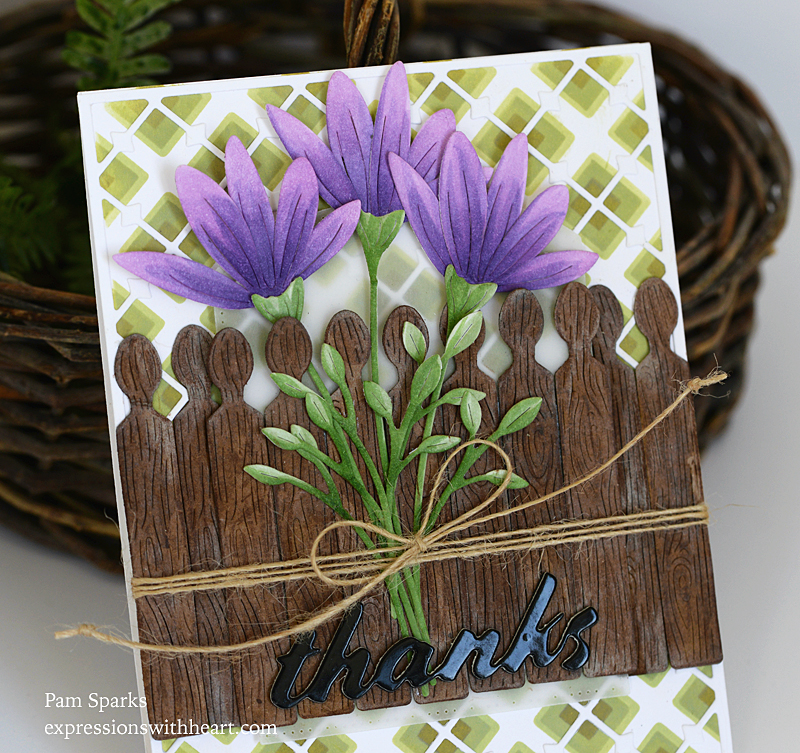
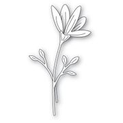
I die cut the NEW Memory Box Floral Bud and Stems die three times and colored with Copics. I remember the greens I used were YG61, 63, 67.
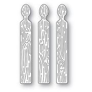
I die cut the NEW Memory Box Woodgrain Fence Pickets from watercolor paper and smooshed them a couple times in Gathered Twigs Distress ink refill and a couple spritzes of water. Then I decided to make them look more weathered and rubbed a white pigment ink pad over them. I still wasn’t that thrilled so I added some brown color pencil! How crazy! Next time I think I’ll die cut them in brown cardstock! hahahahahaha They do look weathered though!
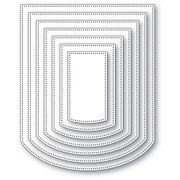
I was following the sketch from the Freshly Made Sketches Challenge blog for my card but I’m too late getting it posted to link up. There was another panel in the sketch so I die cut the NEW Curved Cap Pinpoint Layers die in vellum. I think you can see it behind the flowers and pickets.
I used a piece of wide scor-tape to hold the front pickets together… that worked really slick. Then I wrapped twine/jute cord around the front panel layers before I adhered it to the cardbase.
I die cut the NEW Memory Box Tilted Thanks die from Memory Box Black Glossy Cardstock and two other layers of regular black cardstock and glued them together and glued them to the front of the card.
I don’t have very many pictures because it’s so bright today I ended up taking pictures three times! Picky camera or is it picky me! ha
I have a question for you though, if you don’t mind replying… When I write a blog post, it’s preset that the font is this gray color. If I want it black I have to remember to go in and change it. Do you have a preference? gray or black?
Thank you for stopping by! I hope to be back with a couple more flower cards!

Here’s what I used to make this card…
|


Discover more from
Subscribe to get the latest posts sent to your email.


Absolutely beautiful Pam. I think the wooden fence looks great. Sometimes I have to make a card twice to tweek everything…so many card makers nail it on the first go…..and I think you nailed it! LOVE THIS CARD! I like the grey font. It is soft and pleasing …but whatever you decide works! Have a beautiful spring day!
Beautiful card Pam, I like your stenciling and all the dimension you added.
Beautiful card! Love the stencil design and the flowers! Great fence too!
Either color is fine for the posts. The gray is easy to read since it isn’t too light. That would be my main concern, if some people needed more contrast.
What a great card Pam. Thanks for sharing how you created the fence…a lot of steps but it was worth it! I, too, like the grey. It is not too light. 🙂
Beautiful flowers and love the picket fence!!
Before I forget… I like the gray font. It’s easier on the eyes. I use it on my blog, too. Now… I love your card! I don’t know if it’s your artfully weathered fence that first grabbed me, or maybe the pretty flowers. I will say I think the stenciled background is so cool, especially with the skinny lattice over top. Every little piece of it is amazing!
This makes me yearn for spring! We drove in from Colorado today, and the temp was 59 when we got to MI\issouri! The sun was so hot that we needed to kick on the AC! I’m SO looking forward to warmer days – thanks for sharing!!!
WOW that stencil is amazing!!! Love the colors you used and how you layered the greens – so pretty!! The flowers are absolutely exquisite and adore that fence!!