Hi everyone! Yikes, it’s Thursday already! I almost didn’t buy this NEW Saltwater Taffy ink color! I caved and bought regular, regular refill and oxide. Sometimes I think I need the sprays but maybe I could make a spray with the refill if I needed to make a mess! haha
I used the ink pad to color my cardstock. Hammermill Color Copy Smooth 100# Cover is what I used for all the parts of this card. I use it some for copic coloring too.
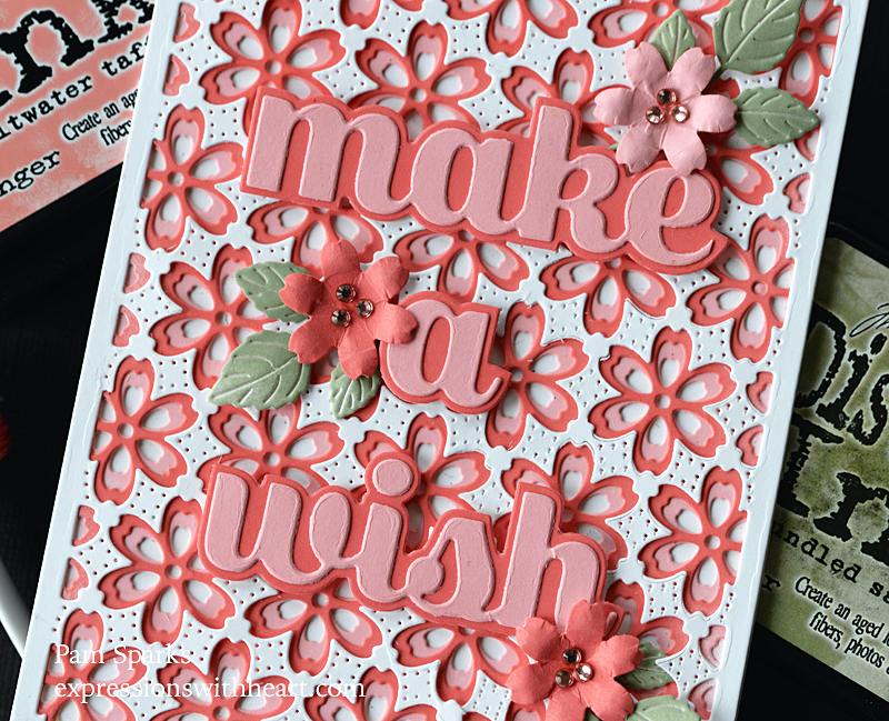
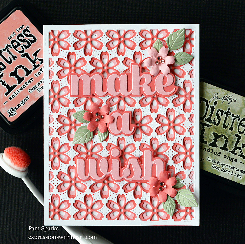
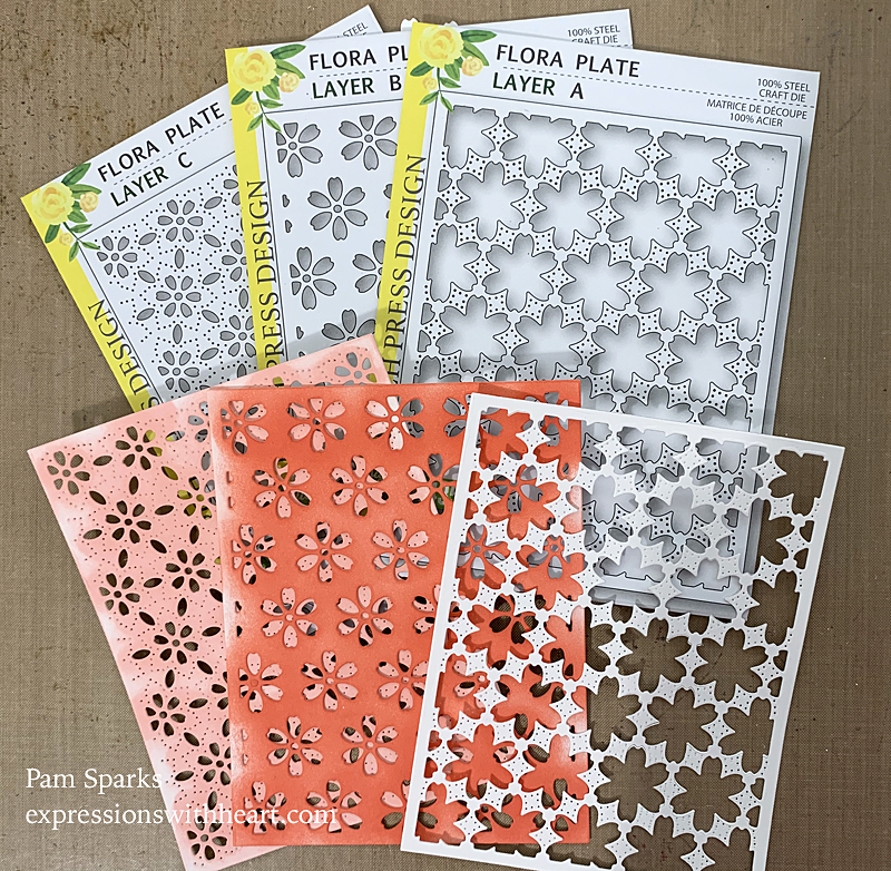
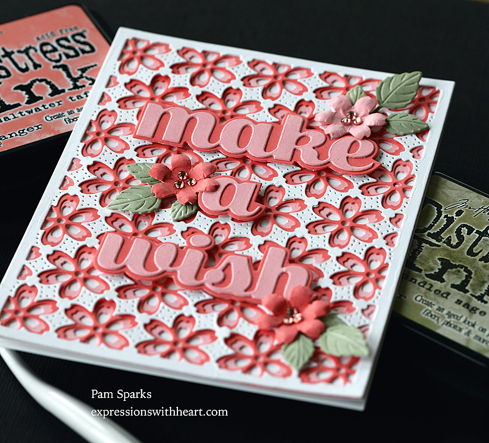
I inked up two A2 panels, one with Saltwater Taffy and one with Abandoned Coral regular distress and blending brushes and or tools. Then I did three smaller pieces with Saltwater Taffy, Abandoned Coral and Bundled Sage. You can pretty much tell what I die cut with what from my pictures.
I die cut the leaves in the same white from the NEW Memory Box Layered Impatiens die set and inked them up also. I love these leaves!
The flowers were the waste from cutting layer A, they were white so I inked them too.
It’s a really pretty, feminine color and card in real life! I had to add some pinkish Memory Box Fairy Jewels to the flower centers.
I made this next card first to get a feel of how the layers looked together. I hadn’t planned on finishing it at first because, weird colors! lol Not Spring at all but I like it so I’m gonna throw one picture of it on here! lol
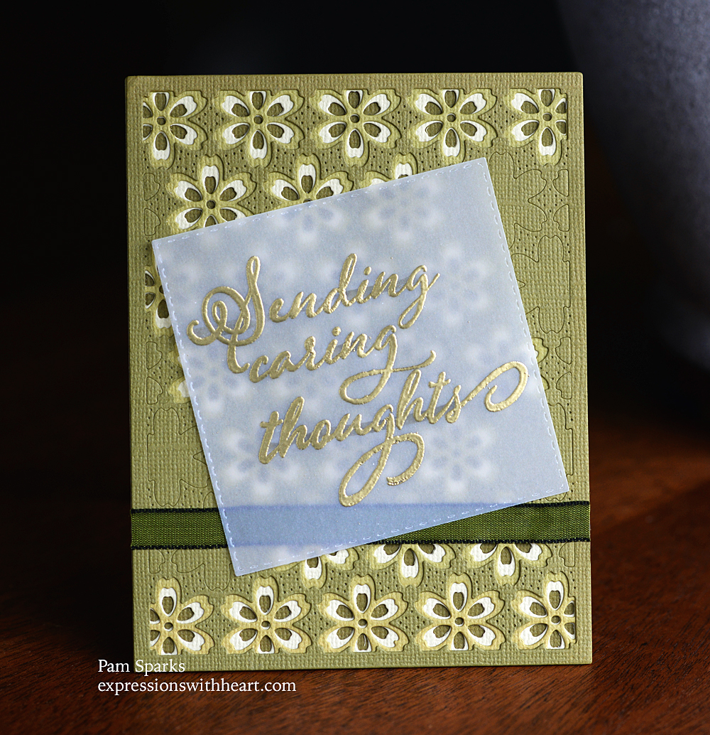
This is the Flora Plate layers AB and C again with a sentiment from the NEW Birch Press Design Kind Hearts stamp set. This is such a gorgeous set! I love it for front and inside sentiments.
Holler if you have any questions! Both cards are A2 size.
Thanks for stopping by!

Here’s what I used to make these cards…
|


Discover more from
Subscribe to get the latest posts sent to your email.


These are so beautiful
So pretty-I especially love the green! I am hoping to hit the basement today and make a couple of cards for my granddaughters for Easter. I usually send them Valentine and St Pat’s cards-but just didn’t get it done this year-so the Easter ones had better be good!!!! Thanks so much for all the ideas!!
OH that is so pretty Pam!! I love those colors in the first one and the layers of dies looks so beautiful! The second one is very pretty too! Love the vellum sentiment!
Lovely cards. I like the green one best, it’s not as busy.
ok, pam…my brain is hurting trying to figure how you did the partial cutting of the top layer on the green card. did you did your put something over the area to cut only part, leaving the uncut area without pressure? did you leave a portion hanging off the plate when you ran the piece thru the die cutting machine (partial die-cutting?) or did you place the cut pieces back in where you wanted the appearance of only “embossed”. does that even make sense? lol!
your crazy friend…sandyh
Awesome cards Pam! I love that “pink”. Thanks for sharing!
i absolutely love both versions – but the colors on the first one are just…WOW!!!!
More pretty cards! You rock ’em and sock ’em, Pam! Love the colors on the first, but I’m also fond of green so those colors don’t look weird to me at all. It makes a nice sympathy card.